5 Things Every Graphic Designer Should Know About Designing for Print
In today’s digital-first world, many graphic designers cut their teeth on screens—not on presses. But if your design is heading to a printing press, what you see on your monitor isn’t always what you’ll get in your hands. Designing for print is a different beast, and overlooking a few critical details can quickly turn a brilliant layout into a costly mistake.
At RoyerComm, we don’t just put ink on paper—we partner with designers to help bring their visions to life exactly as they imagined them. Here are five essential tips to keep your print projects on point:
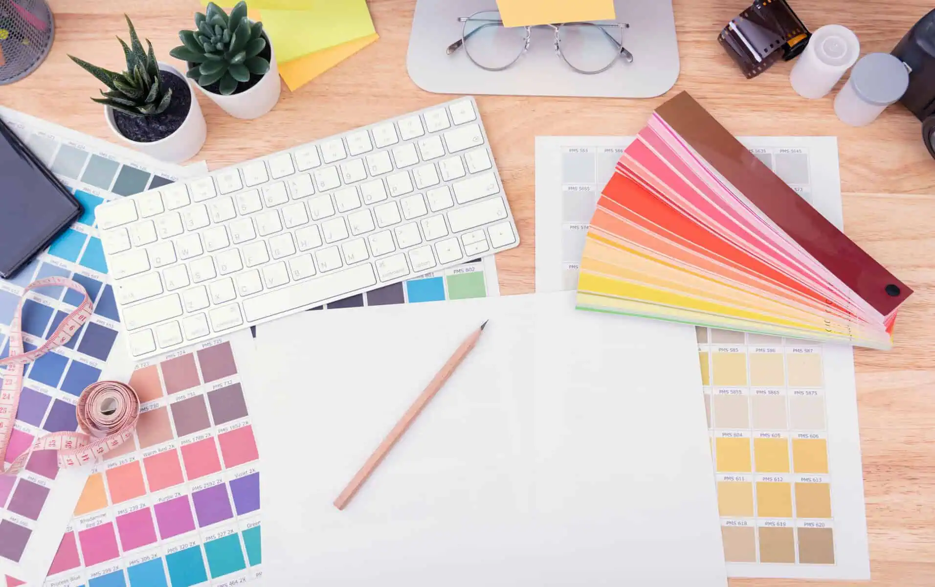
1. Color: RGB vs. CMYK Isn’t Just Alphabet Soup
Screen-based designs use RGB color (Red, Green, Blue), which produces vibrant results on monitors—but not in print. Print requires CMYK (Cyan, Magenta, Yellow, Black), and shifting your design to CMYK can cause unexpected changes in hue, saturation, and brightness.
Tip: Always convert your files to CMYK early in your design process to get a more accurate preview of how your colors will print. For high-impact projects, consider using Pantone colors for precision.
2. Resolution Matters: 300 DPI is the Gold Standard
Web graphics may look sharp at 72 DPI, but print demands a minimum of 300 DPI to maintain clarity and sharpness. Anything lower can result in blurry or pixelated images.
Tip: Start with high-resolution images and vector files wherever possible. Upscaling later won’t fix quality issues—it just magnifies them.
3. Bleeds, Margins, and Trim Lines Are Non-Negotiable
Digital designs don’t need to worry about paper edges—but print does. A design that goes right to the edge of the paper needs a bleed (typically 0.125″) so the ink can extend beyond the final cut. Similarly, important text and logos should stay safely within the margin to avoid being trimmed off.
Tip: Set up your document with proper bleeds and safety zones from the beginning. It’s a small detail that saves big headaches.
4. Fonts and File Types: Keep It Clean and Embedded
Fonts that look perfect on your machine might not be installed on your printer’s system. If a font is missing, it could be replaced automatically—often with disastrous results.
Tip: Convert text to outlines or embed fonts before sending files. Also, use print-friendly file types like PDF/X-1a for reliability and consistency.
5. Paper Is a Design Element Too
Texture, weight, and finish of paper can drastically change how a design feels and is perceived. A minimalist design on matte stock gives a different impression than the same design on glossy, textured paper.
Tip: Consider the end experience. Request samples, ask about paper options, and don’t underestimate how tactile feedback influences how your design is received.
Final Thoughts: Don’t Go It Alone
Designing for print isn’t about restrictions—it’s about refining your creative power with production in mind. And you don’t have to figure it all out yourself. At RoyerComm, we’re more than just a commercial printer—we’re a creative partner that understands the pressure and pride that goes into every design file.
Whether you’re launching your first brochure or managing a complex multi-piece campaign, our team is here to offer guidance, double-check specs, and make sure your final product looks just as stunning on paper as it does in your imagination.
Let’s create something print-worthy together. Get in touch today!
Learn how to print a book with this step-by-step guide for first-time authors. Discover formatting, ISBNs, paper types, and short-run printing options.
Over the years we have accumulated a lot of knowledge about how to create compelling impactful marketing communications. We are here to answer any questions you might have or offer guidance to help take your project from good to GREAT! Give us a call today.