A walk through Philadelphia can feel like a moving mood board for designers. At Royercomm, we see it every day. The skyline, the neighborhoods, the odd mashup of cobblestone and glass towers all find their way into folding cartons, trade show displays, mailers, labels, and brochures.
Here is a printer’s view of Philadelphia and how some of the city’s most iconic landmarks quietly shape smart print design.
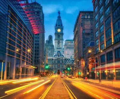
City Hall and the Broad Street Canyon
Design lesson: Grandeur, hierarchy, and focal points
Standing at the center of Broad and Market, City Hall is impossible to ignore. The ornate stonework, the strong vertical lines of the tower, and the statue of William Penn watching over the city create a clear visual hierarchy. Your eye knows exactly where to go first.
In print, that same principle keeps a piece from feeling chaotic. A strong focal point matters, whether it is a hero product on a folding carton, a bold headline on a trade show graphic, or a key call to action on a postcard.
What City Hall teaches designers and print buyers:
- Use scale to establish importance: Big headlines, bold product shots, and confident logo placement mimic the tower’s presence.
- Layer details thoughtfully: Just like the building’s intricate trim, spot gloss, embossing, or foil can add detail without overwhelming the whole.
- Keep navigation intuitive: On a layout, as on Broad Street, viewers should naturally know where to look first and where to move next.
The Philadelphia Museum of Art and the Parkway
Design lesson: Clean structure and dramatic reveals
From the bottom of the Parkway, the Museum of Art sits like a temple of symmetry above the city. The steps, the lines of the boulevard, and the rhythm of the trees all pull your eye toward that one destination.
Great design for print does the same thing. A catalog cover that leads you into the spread, a folding carton that reveals more as you turn it in your hand, a brochure panel that opens like a little stage curtain: all of that is inspired by controlled, intentional structure.
How this shows up in printed pieces:
- Grid systems: The Parkway’s alignment is a reminder that underlying structure keeps creative design from feeling random.
- Rhythm and repetition: Repeating type styles or image treatments across a campaign creates the same sense of journey as walking up the steps.
- Hero moments: Whether it is a full-bleed product image on a carton panel or a dramatic trade show backdrop, every piece needs its “top of the steps” moment.
Old City, Elfreth’s Alley, and the Cobblestone Streets
Design lesson: Texture, authenticity, and storytelling
Old City is layered with history. Brick, wood, slate, and cobblestone sit right next to modern galleries and boutiques. It feels human and hand-crafted, not overly polished.
That is exactly what many brands want reflected in their printed materials today. Texture and tactility communicate authenticity in ways that digital alone cannot.
Print decisions inspired by Old City:
- Uncoated and specialty stocks: A slightly toothy, textured sheet can make a menu, postcard, or hang tag feel honest and artisan.
- Historical nods: Serif typefaces, engraved-style illustrations, or subtle distressing can connect a modern brand to a sense of heritage.
- Layered storytelling: Multiple panels, inserts, belly bands, and short folds can tell a story in chapters, much like walking from block to block through Old City.
The Schuylkill River Trail and Skyline Views

Stand along the Schuylkill River Trail at dusk and you see something powerful: a wide stretch of calm water contrasted with a dense, geometric skyline. It is a reminder that space is not empty. It is active.
In print design, negative space is often the difference between premium and cluttered. Giving content room to breathe can actually make your message feel stronger and more confident.
How the river and skyline guide design choices:
- Ample margins: White space around a logo or headline makes it feel elevated and high end.
- Contrast in materials: High-gloss coatings next to soft-touch laminates echo the contrast of glass towers against water and sky.
- Modern minimalism: Sometimes one strong image, a single color field, and a few words do more than a crowded layout ever could.
Reading Terminal Market
Design lesson: Color, information density, and wayfinding
Reading Terminal Market is an organized chaos of signage, stalls, and people. Somehow, you can still find what you need: that one bakery, your favorite coffee stand, the perfect snack before hopping on SEPTA.
For brands with complex offerings or crowded product lines, this is an important model. Folding cartons, labels, and sell sheets often have to carry a lot of information without becoming visual noise.
Print tactics that borrow from the market:
- Color coding: Using consistent accent colors for product lines, flavors, or categories helps people navigate quickly.
- Typographic hierarchy: Clear headline, subhead, and body styles keep information scannable, like good wayfinding signs in a busy space.
- Strategic emphasis: Callouts, badges, and icons can highlight what matters most: gluten free, new formula, limited edition, or local ingredients.
The Neighborhood Murals
Design lesson: Brand voice, illustration, and emotional connection
Philadelphia’s murals are more than decoration. They tell stories about neighborhoods, movements, and people. Many are collaborative, reflecting the voices of the community.
Printed materials work best when they do the same. A folding carton or direct mail piece can be a small canvas that tells a bigger brand story.
What murals teach us about print:
- Illustration as identity: Custom illustration, whether on a carton panel or in a brochure, differentiates you from stock-photo-heavy competitors.
- Color palettes with meaning: The colors you choose can echo a neighborhood, season, or cultural reference that resonates with your audience.
- Emotional tone: Just like a mural sets the mood of a block, your print pieces set the mood for your brand experience long before someone opens the package or visits your website.
How Royercomm Brings Philadelphia Energy Into Print
As a Philadelphia area printer, we get to work with this visual inspiration every day. It influences how we recommend paper, coatings, and finishing options, and how we collaborate with designers, agencies, and brand teams.
When we look at a project, we are thinking about:
- Structure: Will the layout guide the eye as clearly as the Parkway leads to the Art Museum
- Materials: Does the stock choice feel as honest as Old City brick or as sleek as the Center City skyline
- Detail: Are we using finishing techniques that add value the way City Hall’s ornamentation does, rather than decoration for decoration’s sake
- Wayfinding: Can a customer find what they need on your packaging as easily as a stall in Reading Terminal
- Story: Does every printed piece feel like it belongs in your brand’s “mural” of touchpoints
Print is still one of the most powerful ways to make your brand tangible. In a city filled with design inspiration at every corner, it is our job to help you translate that energy into folding cartons, trade show displays, and marketing materials that people actually want to hold and keep.
If you are ready to let Philadelphia’s landmarks inspire your next print project, Royercomm is here to be your partner from first concept to final box on the shelf. Get in touch with our team today!