Small Design Changes That Can Elevate Your Print Materials
In a world saturated with digital marketing, print materials still hold immense value. A beautifully crafted business card or an eye-catching brochure can leave a lasting impression. Sometimes, the difference between bland and brilliant is in the details. Here are some subtle design tips that can elevate your print materials and make them truly stand out.
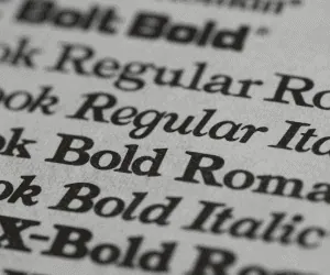
1. Play with Typography
Fonts can drastically impact how your material is perceived.
Tip: Use a mix of serif and sans-serif fonts to create contrast and hierarchy. For instance, try using a bold, serif font for headlines and a clean sans-serif for body text.
Why it Works: Serif fonts convey tradition and reliability, while sans-serif exudes modernity and simplicity. This balance keeps the design visually appealing and easy to read.
2. Focus on White Space
Cluttered designs can overwhelm the reader. Incorporating more white space can dramatically improve readability and aesthetic appeal.
Tip: Avoid filling every inch with text or graphics. Instead, allow breathing room around elements to guide the reader’s eye.
Why it Works: White space creates a sense of sophistication and directs attention to key messages.
3. Add Subtle Texture or Finish
Textures and finishes can give your print materials a tactile edge.
Tip: Consider matte, glossy, or embossed finishes for business cards or brochures.
Why it Works: Physical texture adds a sensory dimension that digital materials lack, enhancing the perceived quality of the piece.
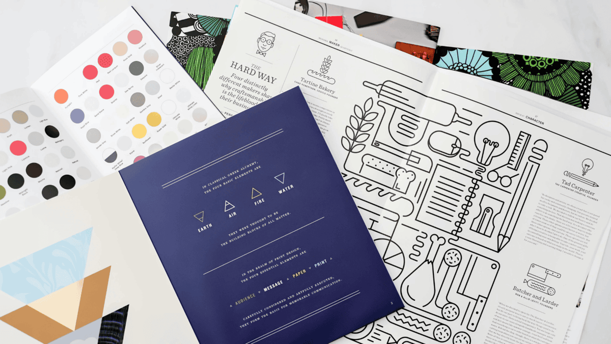
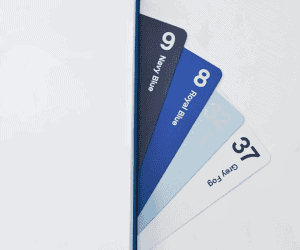
4. Incorporate Color Strategically
Color can evoke emotions and influence decision-making. Thoughtful use of color can make your materials more impactful.
Tip: Stick to a limited color palette (2-3 colors) that aligns with your brand identity.
Why it Works: Consistent use of color reinforces brand recognition and ensures that the design doesn’t feel chaotic.
5. Utilize High-Quality Imagery
Low-resolution or generic images can make your print materials look unprofessional.
Tip: Invest in high-resolution images or professional photography. If using stock photos, choose ones that align closely with your brand’s voice.
Why it Works: Sharp, relevant images add credibility and enhance visual appeal.
6. Opt for Unique Shapes and Sizes
Standard rectangular designs work, but unique shapes can make your materials memorable.
Tip: Experiment with rounded corners, die-cut shapes, or square business cards.
Why it Works: Unconventional formats catch the eye and encourage the recipient to keep your materials longer.
7. Prioritize Readability
Your print materials should communicate clearly and quickly.
Tip: Use larger fonts for key information, ensure proper contrast between text and background, and choose legible fonts.
Why it Works: Clear, easy-to-read materials ensure your message is received without confusion.
Small design tweaks can lead to significant improvements in the effectiveness of your print materials. By focusing on typography, white space, textures, colors, and readability, you can create print products that not only look stunning but also resonate with your audience. Elevating your design doesn’t require a complete overhaul—sometimes, the smallest changes make the biggest impact.
SHARE
Request a Quote
Over the years we have accumulated a lot of knowledge about how to create compelling impactful marketing communications. We are here to answer any questions you might have or offer guidance to help take your project from good to GREAT! Give us a call today.