
Short run book printing has come a long way. What used to feel like a compromise now has real potential to match the look and feel of larger offset runs. The difference between a book that feels standard and one that feels premium usually comes down to a handful of intentional decisions. None of them require a massive budget, but they do require a clear understanding of how materials, finishes, and layout work together.
At RoyerComm, we see this all the time with short run projects for trade shows, branded leave-behinds, product catalogs, and internal sales tools. When done right, even a limited quantity book can feel like a high-end piece that people hold onto.
Paper Selection That Signals Quality
Paper is often the first thing someone notices, even if they cannot explain why. The tactile experience sets expectations immediately.
For interior pages, moving slightly above standard text weight can make a noticeable difference. A 70 lb or 80 lb text stock with a smooth or vellum finish gives more substance without pushing cost too far. Uncoated stocks tend to feel more premium for editorial-style books, while silk or matte coated sheets are ideal for image-heavy content where color accuracy matters.
For covers, the upgrade is even more impactful. A 100 lb or 120 lb cover stock paired with a matte or soft-touch laminate creates a strong first impression. In short run scenarios, where each piece carries more weight, that first touch matters more than ever.
Binding That Feels Intentional
Binding is one of the clearest signals of quality, and it is often overlooked in short runs.
Perfect binding is the most common choice because it balances cost and appearance. The key is execution. A well-built spine with the right paper combination gives the book a more substantial feel and helps it sit properly in hand.
Saddle stitch can still feel premium when used with intention. For lower page counts, combining saddle stitch with heavier cover stock and a well-structured layout can create a clean, modern piece. It works especially well for lookbooks, trade show handouts, and product guides.
For projects that need a step up, lay-flat binding or concealed wire options can enhance usability while maintaining a polished look. These are strong choices for presentation materials or books meant to be referenced repeatedly.
Finishes That Add Depth Without Excess
Finishes are where a book can move from good to memorable. The goal is to enhance the piece without overcomplicating it.
Soft-touch laminate is one of the most effective upgrades for short run book covers. It adds a subtle, tactile richness that immediately communicates quality. Pairing that with spot UV on a logo or title creates contrast and draws the eye without overwhelming the design.
Foil stamping can also be used strategically. Even a small foil detail can elevate the overall feel, especially for brand-driven pieces or premium leave-behinds. The key is restraint. A little goes a long way.
Inside the book, it often makes sense to keep things simple. Let the paper and layout do the work rather than layering on too many coatings.
Layout and Design That Feels Considered
A premium feel is not just about materials. Layout decisions play a major role in how a book is perceived.
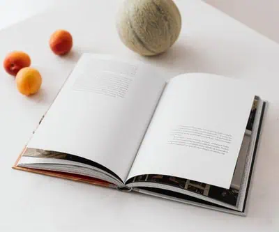
Generous margins, consistent spacing, and a clear typographic hierarchy create a sense of intention. White space is often the difference between something that feels crowded and something that feels refined.
Typography should feel deliberate and consistent throughout. Well-paired fonts and thoughtful sizing help guide the reader and reinforce the overall quality of the piece.
Image quality also plays a big role. High-resolution photography, proper color handling, and clean placement all contribute to a more polished result. This is especially important for books used at trade shows or as part of a sales process, where the piece reflects directly on the brand.

Bringing It All Together
What makes a short run book feel premium is rarely one single decision. It is the combination of paper, binding, finishes, and layout all working together with a clear purpose.
You do not need to overspend to create something that stands out. In many cases, a few smart upgrades and a disciplined design approach are enough to transform a standard piece into something that feels intentional, professional, and worth keeping.
At RoyerComm, we approach short run book printing with this mindset. The goal is not just to produce a book, but to create a piece that represents your brand well and holds up in the environments where it matters most. Get in touch with our team to discuss professionally printing your next book!